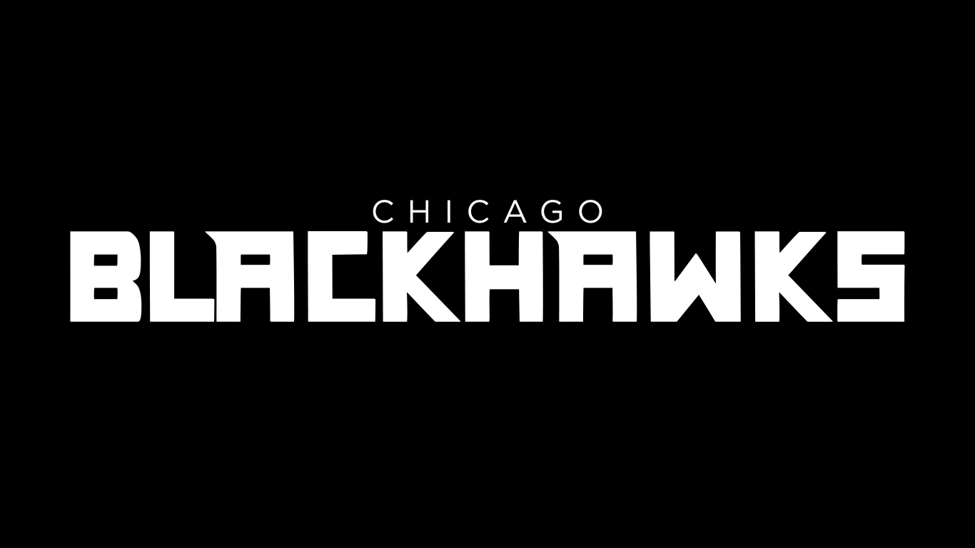
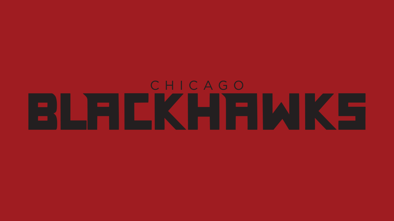
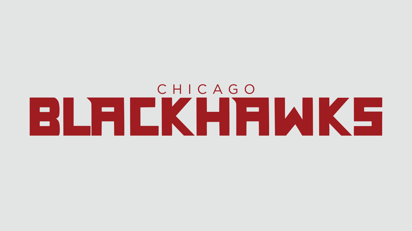
The Chicago Blackhawks were one of the first teams to join the NHL in 1926 when they were purchased from the Western Canadian Hockey League’s Portland Oregon Rosebuds. With being one of the most noticeable teams in hockey, they are in a state of rebuilding. With this rebuild, it is time for a whole new look. They have had the same style logo since they joined the league in 1926 and haven’t had it updated in over 20 years, so I decided to take it in a different direction.
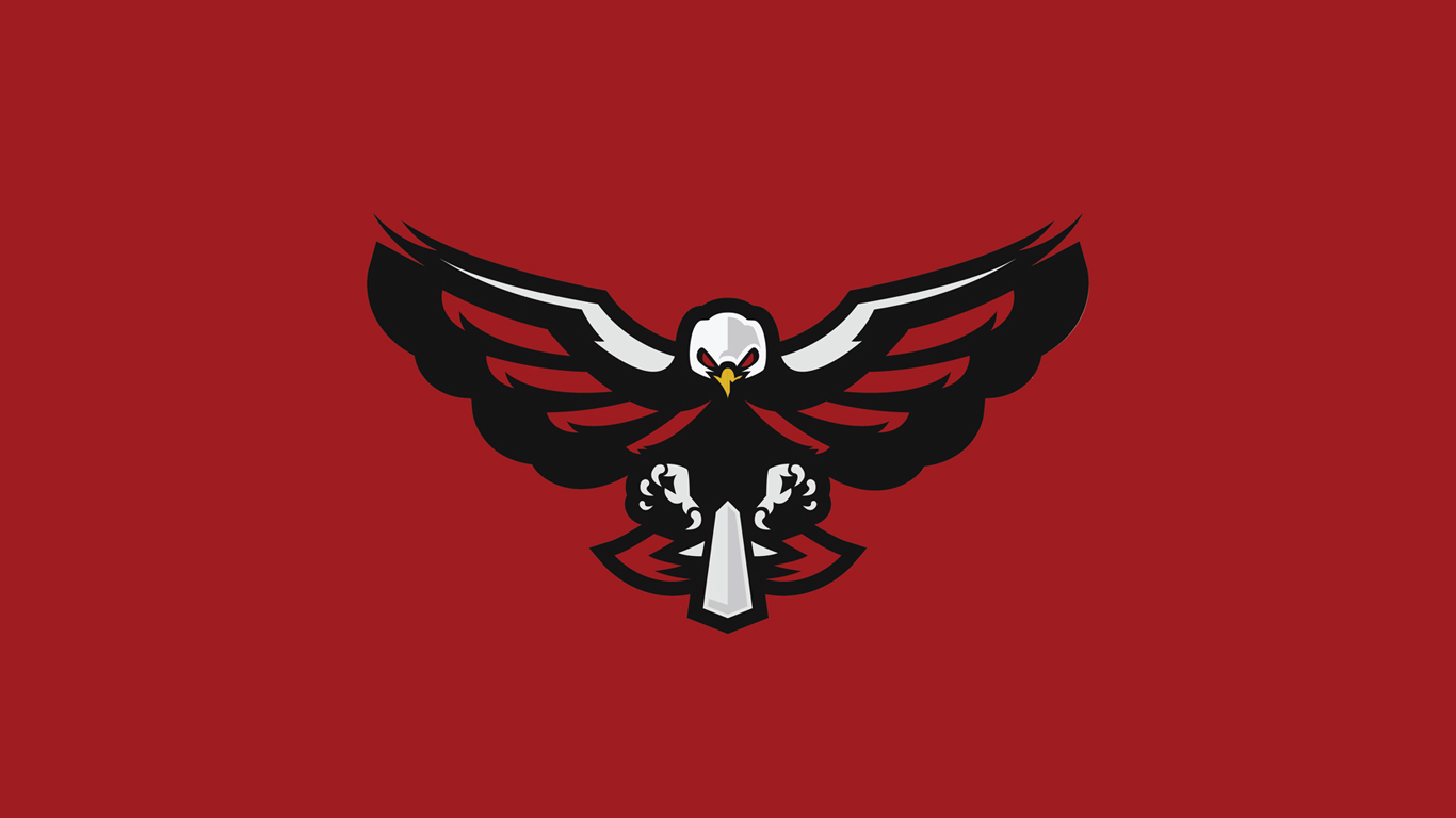
New logo
The Blackhawks are well overdue for a new logo, not just an updated one. We live in a time where their logo can be seen as offensive and they should take a new look at the team. They don’t need to change the name, just the look and the meaning behind it.
old logo
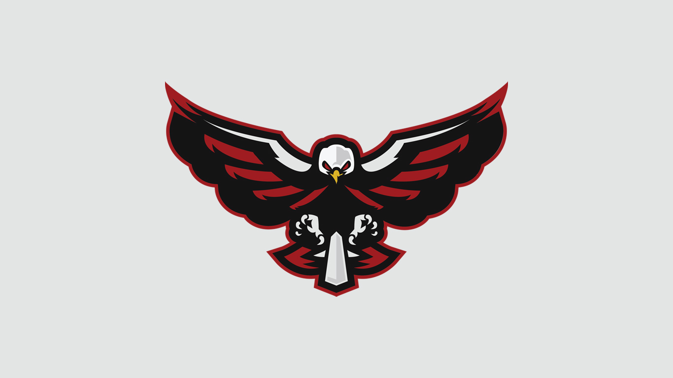
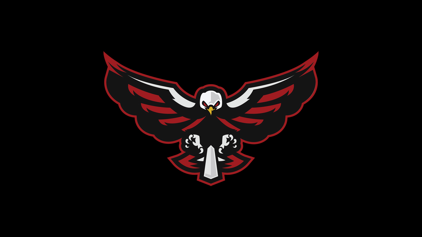
New logo
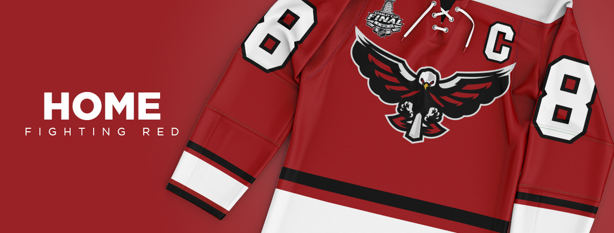
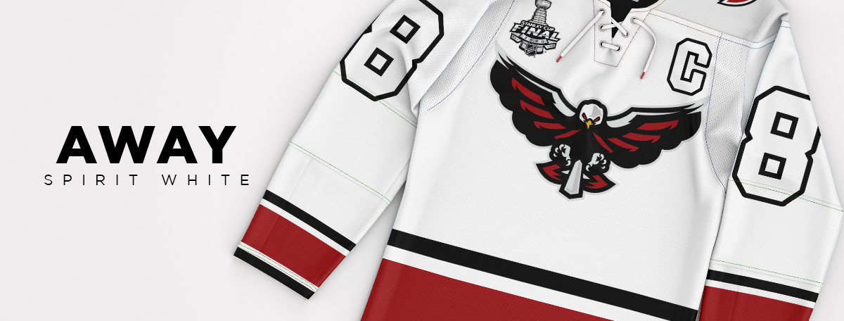
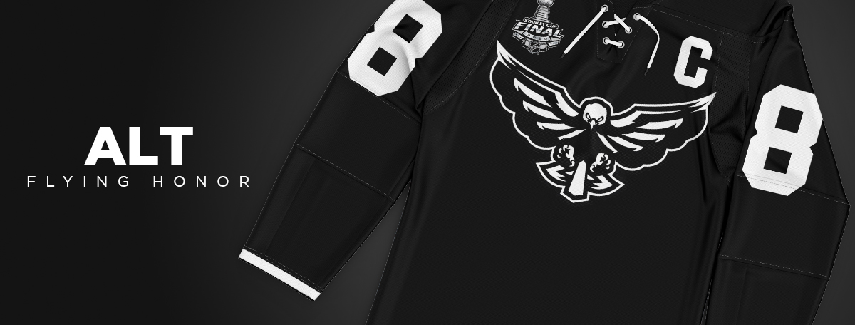
uniforms
A new logo means new threads. Keeping with the color scheme, a new alternate jersey is added for big time home games.
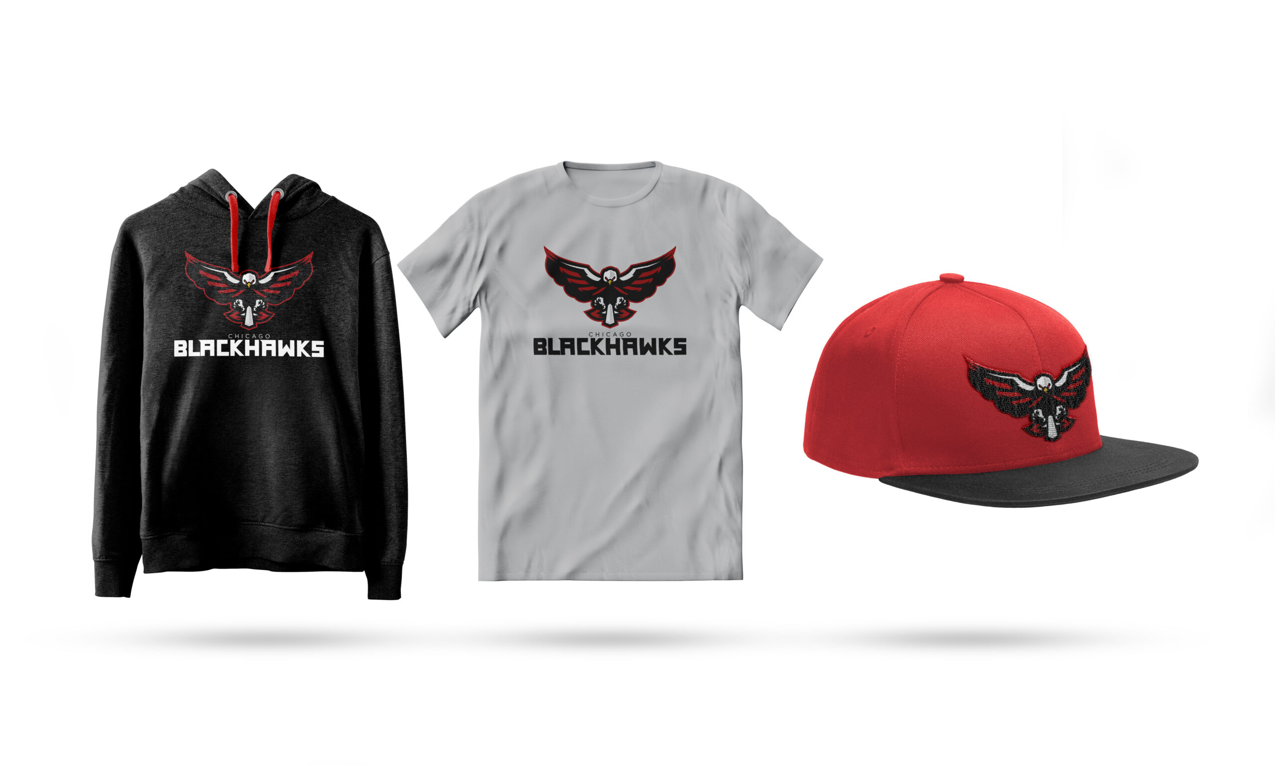
Merchandise
What a better way to represent your favorite team that with some merchandise. With this new look to this team, everyone wants to show their support.